Hello guys, in this tutorial I am going to tell you how to do a Simple Regression Analysis in MS Excel.
For this tutorial, we are using a dataset called “student marks” which contain the attendance percentages of 25 students and the marks they scored for mathematics. The data was collected for 3 months period. You can download the dataset by clicking this link.
In this dataset, ‘student marks’ column is the response variable yi and ‘attendance %” column is the predictor variable xi. Click on this link If you need more information about the variables associated with Simple Linear Regression.
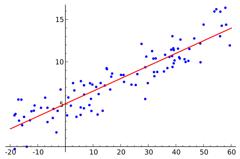
Scatter Plot
First, let’s get a scatter plot for our data. Select the two data columns first. Then click the scatter plot icon in the ribbon under the ‘insert’ tab.
Insert–>Charts–>Scatter Plot
Once you get the scatter plot, go to ‘Quick Layout’ option the ‘Chart Tools’ tab. Select the ‘Layout 9’. This layout displays a regression line.

Then do some quick adjustments to your graph. Sometimes the font is too small and you are not satisfied with the title. You can do these edits easily. When you have finished doing those adjustments, you can get a scatter plot like below.

Okay. Now we have a good Scatter Plot for our data. Also, we have the regression equation too. So the next we have to do the regression analysis in excel.
Regression analysis
Go to the ‘Data’ tab in the ribbon. Click on the ‘Data Analysis’ button.
From the “Data Analysis” dialog box, select ‘Regression’. You can find it at the bottom part of the list.

Now you have a dialog box named “Regression”

I will explain about the sections in this dialog box one by one
Input Section
Select the Input X and Y range. If you need labels, tick the checkbox. Also, If you need the regression line to cross 0 (zero), tick the checkbox named ‘Constant is Zero’. This means that the response variable is zero when the predictor variable is zero.
Output Options Section
Here you can choose where you want your regression results to be displayed. You can give a cell reference if you need to display the output on the current worksheet. Or if you like to have the output in a new worksheet, select that radio button.
Residuals Section
In this section, we can select information and plots on residuals. If you are not interested in residuals, you can leave it blank.
Normal Probability Section
Select this option if you need Normal Probability information in your results. Also, this produces a Normal Probability Plot.
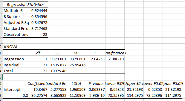
MS Excel Regression Results
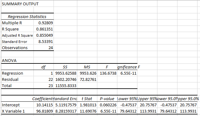
Interpretation of Regression Analysis
When we look at our Scatter Plot, it is clear that there is a positive relationship between the two variables. The “R squared” value also testifies that (Here r-squared = 0.85). R – squared value being closer to 1 tells us that most of the variability in y is explained by the regression model. In fact, a more accurate one is the adjusted r-squared value which is 0.84. Because it takes the number of independent variables into the calculation.
The coefficient of X1 is 96.8. That means for a 1% increase in attendance, 0.96 marks are increased.
Also, the p-value is very small when compared to the significance level. Therefore we can say that there is enough evidence to reject the null hypothesis. That means there is a linear relationship between the two variables. In other words, attendance percentage affects the marks of a student.
Okay, now we have come to the end of this tutorial on regression analysis using Microsoft excel. You can download the excel file for this regression analysis from this link.