Hello friends! I welcome all of you to my blog! Today let’s see how we can understand Multiple Linear Regression using an Example.
In our previous blog post, we explained Simple Linear Regression and we did a regression analysis done using Microsoft Excel. If you missed it, please read that. It will help you to understand Multiple Linear Regression better.
The dataset that we are going to use is ‘delivery time data”.
A soft drink bottling company is interested in predicting the time required by a driver to clean the vending machines. The procedure includes stocking vending machines with new bottles and some housekeeping. It has been suggested that the two most important variables influencing the cleaning time (a.k.a delivery time) are No of cases and distance walked by the driver. You can download the dataset by following this link.
How are we doing the Regression Analysis?
We using Minitab statistical software for this analysis. First, we will be generating a scatter plot to check the relationships between variables. Then we will do a Multiple Regression Analysis including ANOVA test. Finally, we can arrive at a conclusion as to whether there is a relationship between the response variable and predictor variables. Also, if there is such a relationship, we can measure the strength of that relationship.
Our steps can be summarized as follows :
- Identifying the list of variables
- Chech the relationship between each independent variable and a dependent variable using scatterplots and correlations
- Check the relationship among independent variables using scatter plots and correlation (Multicollinearity)
- Conduct Simple Linear Regressions for each Independent and Dependent variable pair
- Finding the best fitting model
Variables
Our Response Variable or ‘y’ variable is Delivery Time. We have two predictor variables here. One is the Number of Cases (x1) and the other one is Distance (x2).
Scatter Plot (Matrix Plot)
Let us generate a scatter plot to visually examine the relationship between the variables. In fact, this is called a matrix plot in Minitab. It compares the relationship between multiple x and y variables.
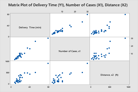
From these scatterplots, we can see that there is a positive relationship between all the variable pairs.
Also, this type of visualization helps to detect Multicollinearity between predictor variables. Multicollinearity is the situation when predictor variables in the models are correlated with other predictor variables. Minitab documentation on Multicollinearity is here.
To get further idea about Multicollinearity, let’s generate a scatter plot.
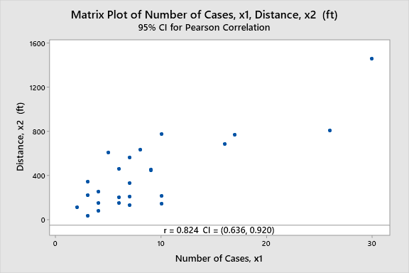
In the above scatter plot, the correlation coefficient (r) is 0.824. That means there is a strong positive correlation between the two variables. Therefore multicollinearity is present. But in the real-world, this doesn’t make any sense. How can the Number of Cases affect the distance? Therefore we need not to worry about this here.
Simple Linear Regression for Delivery Time (y) and Number of Cases (x1)
Null Hypothesis: Slope equals to zero
Alternate Hypothesis: Slope does not equal to zero
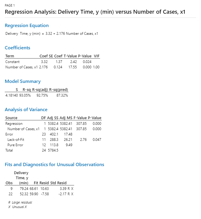
In the above Minitab output, the R-sq(adj) value is 92.75% and R-sq(pred) is 87.32%. This means our model is successful. Our model is capable of explaining 92.75% of the variance.
Here keep an eye on the metric “VIF”. This is called the Variance Inflation Factor. It points out the variables that are collinear.
If no variables are correlated, VIF = 1. If 5<VIF<10 High correlation and may be problematic. If VIF>10 regression coefficients are poorly estimated due to multicollinearity.
In this case VIF =1. Obviously it should be 1 because we only have one predictor variable here.
Also, the p-value is less than the level of significance. It means we have enough evidence to reject the null hypothesis
Simple Linear Regression for Delivery Time (y) and Distance (x2)
The hypotheses are the same as above;

Here the R-sq(adj) is 78.62%. It is somewhat lower than the first model. Comparatively, it means that the variable x1 does a good job at explaining y than x2.
Okay, let’s jump into the good part! The multiple linear regression analysis!
Multiple Linear Regression Y1 vs X1, X2
Null Hypothesis: All the coefficients equal to zero
Alternate Hypothesis: At least one of the coefficients is not equal to zero.
Note when defining Alternative Hypothesis, I have used the words “at least one”. This is very important because it should mean precisely our intention. For example, if you say “All the coefficients” the meaning is different from our intention.
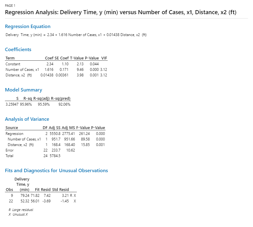
Here you can see the VIF = 3.12. That means a small amount of Multicollenearity is present in our model. R-sq(adj) value is 95.59% which is pretty good. 95% of the variation in the Response Variable is explained by the model.
The p-value is less than the significance level. Therefore we have enough evidence to reject the null hypothesis.
Also, look at the error term. In our multiple linear regression model, the error term is 233.7. While in our simple linear regression models, the error terms are 402.1 and 1185.39 respectively. This means that by adding both the predictor variables in the model, we have been able to increase the accuracy of the model.
But keep in mind that this may not be the case in some cases. Sometimes when you have Multicollineariy within predictor variables, you may have to drop one of the predictors. This is why I encourage you to the Simple Linear Regressions before jumping into the full model. That way you have an idea of how the variables and other metrics behave.
Conclusion
We can conclude that both predictor variables have an impact on delivery time. Also, the inclusion of “No. of Cases”, “Distance” variables in the model show significant improvements over the smaller models.