Introduction to Box Plots
Box Plots (also known as Box and Whisker and Diagram) are used to get a good visual idea about the distribution of data and spot outliers. In this post, we will be creating attractive and informative box plots using ggplot2 package that comes with R.
A box plot takes the following form;
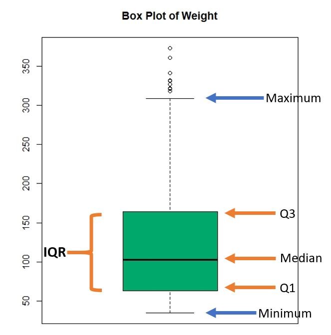
We have marked the structure of a box plot in the above illustration. You can clearly spot the outliers and the quartiles.
Now let’s create box plots using ggplot2 package.
Box Plot for a Quantitative Variable
Here we are using the “ChickWeight” dataset that comes with RStudio.
A glimpse of the dataset is given below
> head(ChickWeight) weight Time Chick Diet
1 42 0 1 1
2 51 2 1 1
3 59 4 1 1
4 64 6 1 1
5 76 8 1 1
6 93 10 1 1Let’s check the data type of each column
> sapply(ChickWeight,class)
$weight
[1] "numeric"

$Time
[1] "numeric"

$Chick
[1] "ordered" "factor"

$Diet
[1] "factor"
It appears that we have two quantitative variables and two categorical (factor) variables.
Basic Box Plot
Keeping that in mind, lets plot a box plot for the “weight” variable using ggplot2.
ggplot(ChickWeight, aes(y = weight)) +
  geom_boxplot()+ggtitle("Box Plot of Weight")
The ‘geom_boxplot’ function creates the box plot and ‘ggtitle’ function puts a title to the box plot.
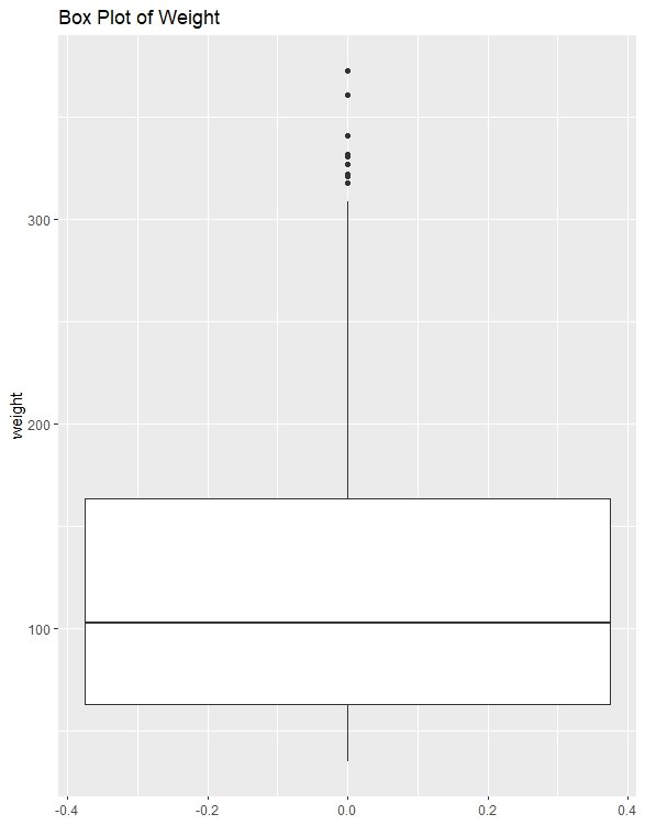
Here you can see that the median is approximately 100 and you can spot some outliers as well.
Showing Outliers
We can specify the outlier display styles as below;
ggplot(ChickWeight, aes(y=weight)) +
  geom_boxplot(outlier.colour = "red", outlier.shape = 8, outlier.size = 2)
In the above code, I have used ‘red’ colour to represent outliers and shape no. 8 as the symbol for the outlier. There are many shapes you can choose from and R represents each shape by a number (a star is represented by number 8). You can find more information about shapes in R from this link. The ‘outlier.size’ argument stands for the size of the outlier shape. In fact, all these arguments are pretty intuitive.
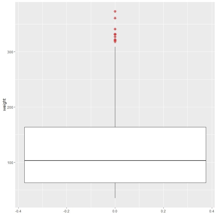
See how clear it is! You can clearly spot the outliers as they are marked in red star marks.
Changing the fill color
If you want to change the fill color of the box plot, type the following code in R
ggplot(ChickWeight, aes(y=weight)) +
geom_boxplot(outlier.colour = "red", outlier.shape = 8, outlier.size = 2, fill='#00a86b', colour='black')
The above function contains 2 new arguments namely ‘fill’ and ‘colour’. The ‘fill’ argument defines the colour inside the box or the fill colour. The argument ‘colour’ defines the outline colour of the box. In this case, it is set to black.
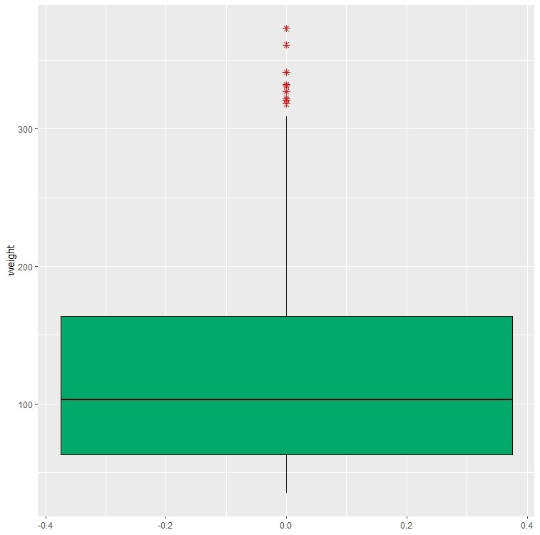
Here we have used a hex colour code as the fill colour. You can use any colour you like in the form of hexcode or choose one from the R default colours. Or you can type colors() in R Studio console to get the list of colours available in R.
Box Plot when Variables are Categorical
Often times, you have categorical columns in your data set. ggplot2 generates aesthetically appealing box plots for categorical variables too. And it is the same way you defined a box plot for a quantitative variable.
ggplot(ChickWeight, aes(x=Diet, y=weight)) +
  geom_boxplot() + ggtitle("Box Plot of Weight with Diet Type")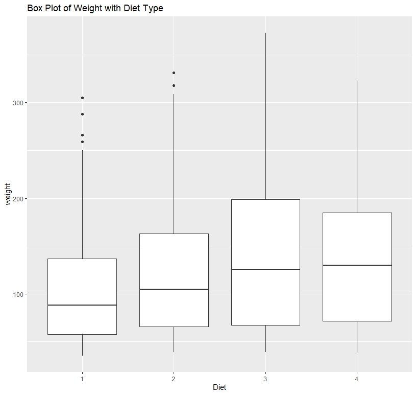
Here you can see how the weight is distributed according to the diet categories.
Box Plot will with different colors
We can also fill our box plot according to the categories of the ‘diet’ variable.
ggplot(ChickWeight, aes(x=Diet, y=weight, fill=Diet)) +
  geom_boxplot() + ggtitle("Box Plot of Weight with Diet Type")
In the above code, I have added a new argument to the ‘ggplot’ function. The ‘fill’ argument defines the fill of the box plot.
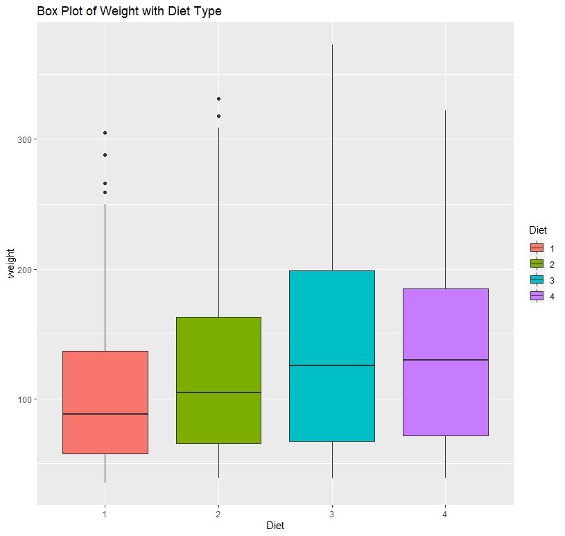
WOW! right? See how beautiful it is! Plot is nicely categorized according to a color scheme and everything is very appealing. You also get a legend telling which color belongs to which category.
Fill Box Plot with Color Brewer Palette
If you are not satisfied with the colours associated with categories, you can use ‘color brewer’ palettes to define a color scheme. We use the scale_fill_brewer() function for this.
ggplot(ChickWeight, aes(x=Diet, y=weight, fill=Diet)) +
  geom_boxplot() + ggtitle("Box Plot of Weight with Diet Type") +
  scale_fill_brewer(palette = 'YlGnBU')
Please refer the brewer color palettes from this link.
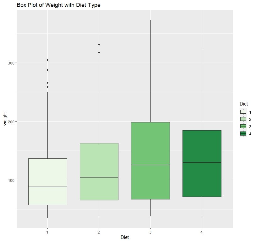
Here I have shades of green to categorize my box plot.
Adding a theme to a Box Plot
In ggplot2, we can even add a theme for our plots. Here’s how you add a theme to our box plot.
ggplot(ChickWeight, aes(x=Diet, y=weight, fill=Diet)) +
  geom_boxplot() + ggtitle("Box Plot of Weight with Diet Type") +
  scale_fill_brewer(palette = 'YlGnBU') + theme_light()
Here, the ‘theme_light()’ function does the trick.
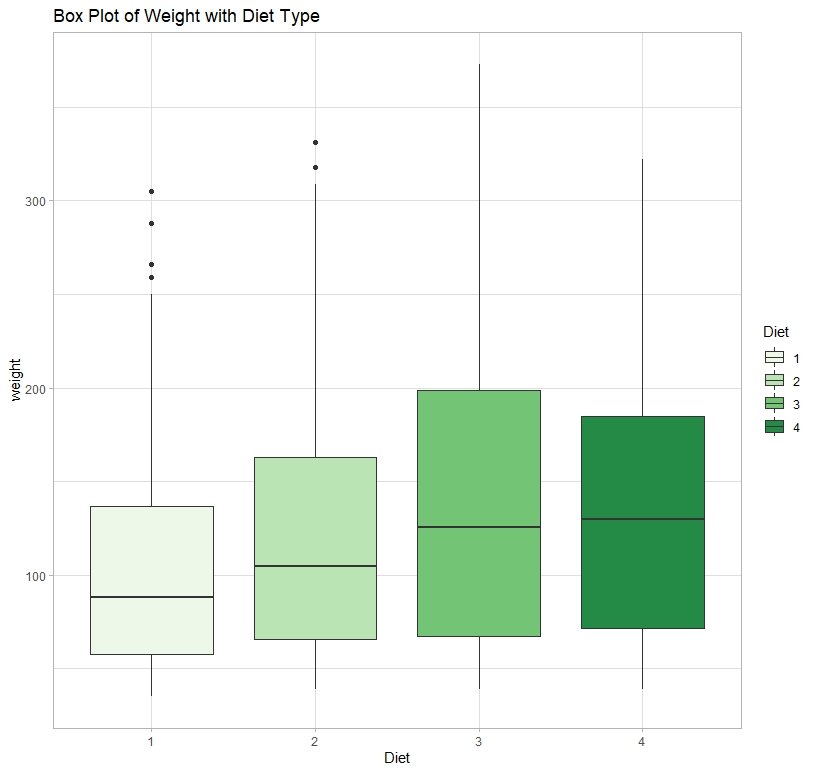
There are several types of themes in ggplot2.
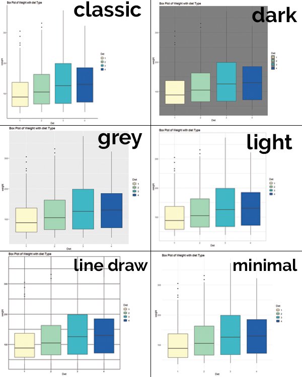
You can choose the type of theme by typing the theme name after the underscore.
Ex : if you want to choose the ‘minimal’ theme, you may type theme_minimal()
Display means in the Box Plot
Sometimes, it is convenient to show the mean of the distribution in the box plot. We use the function stat_summary for that.
ggplot(ChickWeight, aes(x=Diet, y=weight, fill=Diet)) +
  geom_boxplot() + ggtitle("Box Plot of Weight with diet Type") +
  stat_summary(fun=mean, geom="point", shape=17, colour='red', size=4)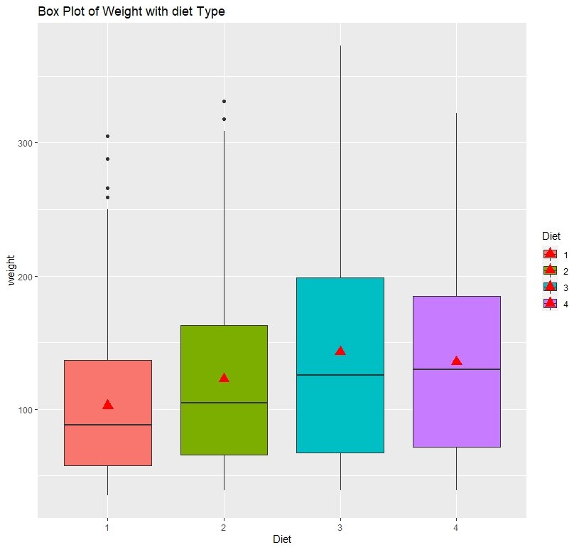
In the above box plot, the red colored triangle display the category means.
Horizontal Box Plot
We can create a Horizontal Box Plot using ggplot2 with the coord_flip function.
ggplot(ChickWeight, aes(x=Diet, y=weight, fill=Diet)) +
  geom_boxplot() + coord_flip()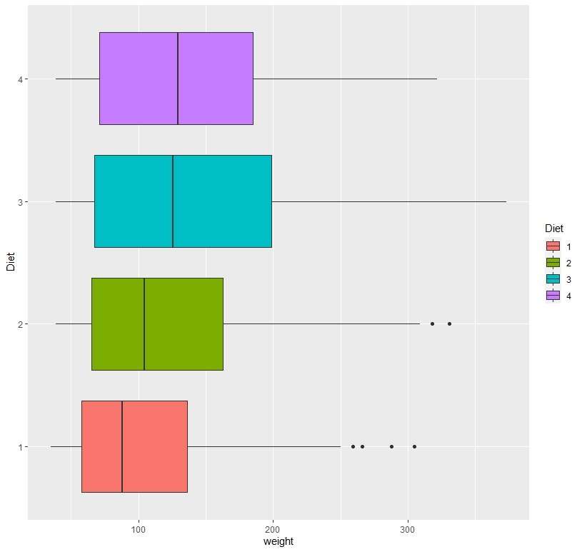
Conclusion
Okay, now we have come to the end of this post. We have covered almost all the important aspects of creating box plots using ggplot2. Feel free to comment if you come across any difficulty.
Cheers!
References
- http://www.sthda.com/english/wiki/ggplot2-box-plot-quick-start-guide-r-software-and-data-visualization
Similar Posts Like This Post;

Very useful. Thank you so much
Thanks a lot. If you want tutorials in other topics, please tell me.
Please subscribe to our blog to get latest updates.
You are welcome! Happy to help!