Introduction to Data Visualization
We use histograms to visualize continuous variables.
In a histogram, the area of each block is proportional to the frequency.
Histograms break data into bins (groups/classes) and display the distribution of the frequency of those bins.
For explanations, we will use the “Orange” dataset which comes as a default dataset in R Studio.
Importing “Orange” dataset into R Studio
Before doing any visualization, let’s import the dateset into R workspace.
> data("Orange")
#creating a data frame called "df" to store the data
> df<-data.frame(Orange)
Let’s have a peek on our dataset.
> head(df) Tree age circumference
1 1 118 30
2 1 484 58
3 1 664 87
4 1 1004 115
5 1 1231 120
6 1 1372 142This dataset contains details about the Growth of Orange trees.
Let’s check the data type of each of the variable.
> sapply(df,class)$Tree
[1] "ordered" "factor"
$age
[1] "numeric"
$circumference
[1] "numeric"
It seems that we have one categorical/factor variable and two quantitative (numeric) variables.
Now that we have a good idea about the data types and dataset, it’s time to move into the good stuff! The VISUALIZATION!
Histogram
We can generate a histogram for the data using the following code in R.
> hist(df$circumference, col='#41b3a3', main = 'Histogram of Circumference', xlab='Age')First argument is the variable which we want to plot and the ‘col’ argument stands for the color of histogram. These arguments are pretty intuitive and I suggest you should do some trial and error experiments with this function in order to make yourselves familiar with it.
This is the output of the function,
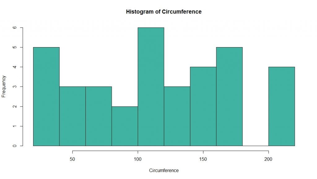
By looking at the above histogram it is clear that most of the orange trees have a circumference of over 100mm or more. But you may have noticed that we cannot get a more precise idea from this histogram since the grouping (binning) of x-axis is not clear. Therefore, its better to group the values of circumference in order to get a better picture about data.
R can do binning automatically. But it is better to specify the bin width by ourselves.
In general, number of bins is determined by taking the square root of the number of data points. Here we have 35 data points. Therefore we can take 6 as the number of bins.
Bin width can be determined by dividing the range by the number of bins.
For this we need to know the range (maximum-minimum values) of circumference.
> range(df$circumference) [1] 30 214The minimum value is 30 and maximum is 214. Therefore the range is 214 – 30 = 184.
Hence the bin width is 184/6 = 30.6 rounded up to 35 approximately.
hist(df$circumference, breaks = c(30,60,90,120,150,180,215),col='#6b8f23', main = 'Histogram of Circumference', xlab='Circumference')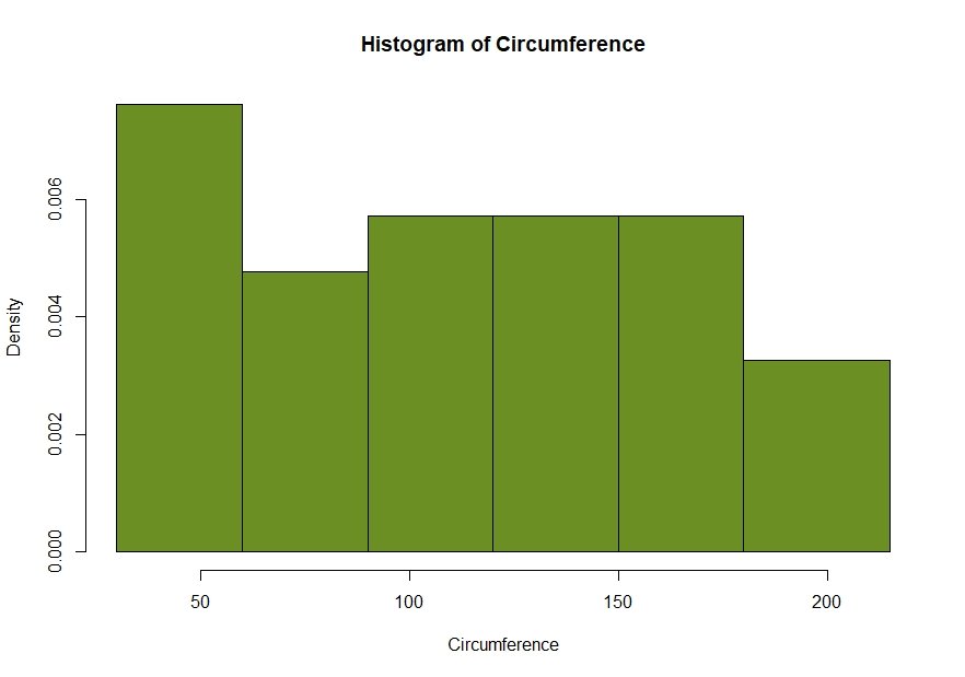
Notice in this binned histogram, there are densities instead of frequencies in the y axis. Actually this is a density plot, not a histogram. In a density plot, area of each column corresponds to the relative frequency of that interval (class/bin).
In this case, we need a binned histogram, not a density plot. For that, we need to add an additional argument to the “hist” function. We have to set “freq = TRUE”
hist(df$circumference, breaks = c(30,60,90,120,150,180,215), col='#00a86b', main = 'Histogram of Circumference', xlab='Circumference', freq = TRUE)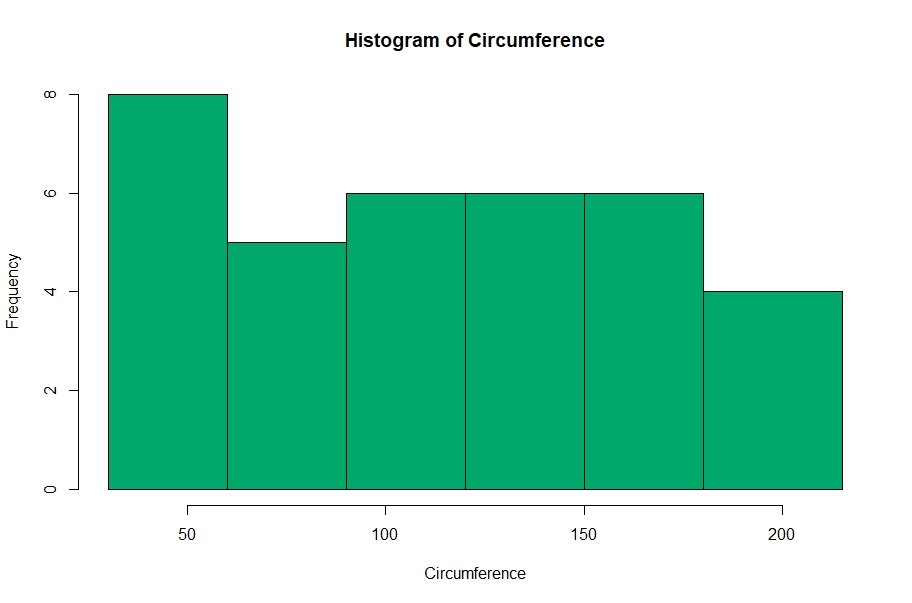
Conclusion
Okay now we have covered almost all the aspects regarding Histograms in R. Now it’s your turn to play around with these options. After all, practice makes perfect!
References
- https://www.r-bloggers.com/basics-of-histograms/
- https://online.stat.psu.edu/stat414/node/120/
- https://rpubs.com/rodolfo_mendes/change-number-bins-histogram